Technically Speaking, March 2024

Welcome, dear readers, to another edition of your technical analysis resource! Today, I want to shift gears and discuss a topic crucial to our long-term success: the ongoing evolution of our trading strategies.

When I was learning to play table tennis as a kid, I began by observing school seniors who played the sport. I tried to emulate them, and to my surprise, I started playing well against my peers (in their defense, to them, it was a sports class, but in my head, it was a national tournament). Having felt victorious over my classmates, I began seeking senior players to compete with. The match started, and their first serve completely stumped me. And let’s just say the following eleven points scored by my opponent had more than eleven lessons for me to learn. But for the first time, scoring a zero was less disappointing and more enthralling. I was blown away by the technique, variety of shots, strategy, and range of body movements that a game like table tennis could demand (I told you I was new to it)! I learned how different it was to play pace versus spin, smash shot versus drop shot, and the importance of waiting to play the shot.

The reason I ran down memory lane is that our trading/investment strategies are very much like sports. We begin with the basics and, over time, incorporate more indicators or cross-asset analysis to develop a system that would work in all market conditions. The only way to do that is when we share our knowledge. What a blessing to be part of a community that is willing to share its learnings, experience, and market research. 

The market is a living, breathing entity that constantly adapts and throws curveballs. Sometimes, it sneezes, and we get a quick jerk in the market, and sometimes, it’s in the mood for a marathon (like Nvidia). There is no one secret golden indicator that works for everyone. We are responsible for identifying our style, risk profile, and time period and developing a system that works towards our goals. But since we’re dealing with a living, breathing entity, we need to update our systems occasionally. 

Que the CMT Association. 

The CMT Association fosters a community of dedicated members, volunteers, and partners. Our member-driven research presentations, regularly updated on our website under the Education e-learnings tab, showcase innovative technical analysis methods developed by your peers. These presentations delve into emerging indicators, unique chart patterns, and creative ways to combine existing tools. This constant flow of fresh ideas will help you stay ahead of the curve.

If you’re looking for the treasure trove, I can point you right to it: TREASURE TROVE.

These member presentations offer wonderful lessons, and I request that you open the link and take a look at the variety of content available to you. It’s the NETFLIX of Technical Analysis; we ought to scroll through these options just as diligently! 

Until we meet again, Think Technical! 

Rashmi Bhatnagar,

Editor

What's Inside...

President's Letter

Dubai, one of the most popular and growing financial hubs in the world for market participants, just played host to...

Read More

Notice of Annual Meeting

You are invited to participate in the Annual Membership Meeting of the CMT Association, Inc., which is scheduled to take...

Read More

Equities Are In The Spotlight But Its Time For A Broader Conversation.

This new environment calls for a return to old approaches.

The journeys continue, and there is...

Read More

Equity Bull Run Isn't Over, But Maybe Start Prepping

It’s too soon to call a significant turn despite some barriers.

It’s been a while since we last spoke…...

Read More

Silently Winning

Energy is now the best performing US sector year-to-date. This may catch a lot of people by surprise. I know...

Read More

10-Year Treasury Rates: A Monthly/Secular Perspective Overview

I begin each year by reviewing the long-term technical positions and behaviors of what I think of as the “Big...

Read More

ESG and SRI: Using Technical Analysis

Back in the day (and to me, that means the mid-2000’s) when I was 4+ years into my career, I...

Read More

President's Letter

Dubai, one of the most popular and growing financial hubs in the world for market participants, just played host to the CMT Association’s first ever regional symposium in the Middle East (Dubai Summit 2024)! 186 participants spent February 29th at the Museum of the Future listening to speakers from around the globe and headed to a gala dinner overlooking the venue by night. I am waiting (im)patiently for the video archive of the event to be released so I can review the content; in the meantime, please check out a few photos posted below of attendees and a link of the speaker lineup (https://cmtassociation.org/event/cmt-summit-dubai-2024-2/). Instead of holding one major symposium each year in New York, we are pivoting to a regional model going forward. The success of the conferences in Tampa and Dubai could not have been done without global sponsors, CMT Staff, and our volunteer base, so we thank you each one of you. Future successful regional conferences will require dedicated volunteers and advance planning!

Women in TA, a group led namely by Gina Martins Adams, Kelly Corbiere, Karen Benefiel, and Sandra Stoutenburg, hosted their first educational webinar this month. The session had 26 participants with Gina leading the presentation. The group plans to hold quarterly virtual meetings; the next webinar is scheduled for May 3rd at 12pm with Connie Brown as the guest speaker. For those members who would like to sign up for the event, please email Barbara Terry at barbara@cmtassociation.org and she will send out the details and include you on the distribution list. I personally love that several members’ groups are building up personalized networks, such as the Black Caucus and Women in TA. I would encourage other interested groups to do so with the Association’s assistance.

The Board of Directors will be busy in April with our second quarterly meeting of the calendar year, along with our annual Long Range Planning meeting towards the end of the month. In addition, the new slate of Directors will be released to our membership. The Annual Meeting will take place in June and we will release the details to you very soon.

Contributor(s)

Robert Palladino, CMT

Robert Palladino, who holds a Chartered Market Technician (CMT) designation, is a senior foreign exchange trader for JPMorgan Chase with experience trading foreign exchange, commodities, and interest rate products, including derivatives. His foreign exchange career has allowed him to work in Hong...

Notice of Annual Meeting

You are invited to participate in the Annual Membership Meeting of the CMT Association, Inc., which is scheduled to take place on Thursday, 20 June 2024, at 10:00 AM Eastern Time by video conference.

Online proxy voting for the annual meeting will commence on 6 May 2024 and continue through 11 June 2024. You will receive an email with detailed instructions for voting on 6 May 2024.

The 2024 Annual Membership Meeting will be conducted entirely on-line.  Registration information for the meeting will be posted shortly on the Association’s website.  The Annual Meeting is open to all members of the CMT Association, however only Professional, Emeritus and Honorary Members are entitled to vote and will receive the proxy voting materials.

Preliminary Agenda

Date: Wednesday 19 June 2024

Time: 10:00 AM EDT

Location: virtual, details to be published to the Associations website in April.

ORDER OF BUSINESS

Reports by the CMT Association

Rob Palladino, CMT, President

Alvin Kressler, Executive Director & CEO

Election of CMT Association Directors for fiscal year starting 1 July 2024

In accordance with the CMT Association Constitution, the CMT Association Governance Committee presents the following slate of candidates for Director at Large to serve a 3-year term beginning July 1, 2024.

  • David Lundgren, CMT, CFA
  • Robert Palladino, CMT
  • Akira Homma, CMT, CFA, CFTe, MSTA, FRM, CIIA, CMA
  • Ari Wald, CMT, CFA


Election of CMT Association Officers for fiscal year starting 1 July 2024

In accordance with the CMT Association Constitution, the CMT Association Governance Committee has presented the following slate of candidates for Executive Officer to serve a 1-year term beginning on July 1, 2024. Members should vote “YES”, “NO”, or “ABSTAIN” for the recommended slate.

  • President: Rob Palladino, CMT
  • Vice President: John Kolovos, CFA, CMT
  • Treasurer: Karen, Benefiel, CMT, CPA
  • Secretary: Kelly Corbiere, CFA, CMT, CFP®


Proposed changes to the Association’s by-laws

Additional details will be provided on the recommended changes to the Association’s by-laws in April.

New Business

Adjournment

The Annual Meeting is open to all Members of the CMT Association, who are welcome to attend.

Please contact the staff by e-mail at admin@cmtassociation.org if you have any questions.

Contributor(s)

Dr.Kelly Corbiere, CMT, CFA, CFP

Kelly Corbiere, CFA, CMT, CFP has over 25 years of experience in financial services. She has worked in wealth management, as a global equity analyst and in institutional taxable fixed income. Kelly holds both a Bachelor of Business Administration in Finance and a Bachelor...

Equities Are In The Spotlight But Its Time For A Broader Conversation.

This new environment calls for a return to old approaches.

The journeys continue, and there is rarely a dull moment.

Stock market indexes continue to climb, and participation is robust. This week has seen the most stocks making new highs in nearly three years. New highs in new highs lead to new highs elsewhere. Financial stress is absent and, at least for now, this everything rally is on firm footing.

Simply put, if this isn’t putting a smile on your face, you might just be a congenitally unhappy person.

For a closer look at current breadth and trend conditions, download and review our latest Bull Market Behavior Checklist.

But as engaging, or even entertaining, as it may be to consider the relative health of an equity market rally, the more important questions for the months and years ahead have to do with portfolio management from an asset allocation perspective. There is ample evidence that equity market returns over the next decade are unlikely to match the experience of the past decade.

For many, asset allocation now means a binary decision between stocks and bonds. Remembering to include commodities as part of the asset allocation conversation (even if they are not always part of the portfolio) will be one of the keys to success going forward. This is not a novel insight – it is remembering the lessons of history. As you can see below, commodities right now are not just asking to be discussed in conversation, they are deserving to be included in portfolios.

As I told one of my Econ students earlier this week, smaller moves that keep you in harmony with the underlying trends can help avoid big mistakes in periods of stress or euphoria. Investment decisions have both a financial and psychological calculus. Ignoring this reality and refusing to adapt to market conditions can be expensive.

Contributor(s)

William A. Delwiche, CMT, CFA

Willie Delwiche has over two decades of experience providing perspective on the financial markets and the economy, including 15+ years of active risk management through a suite of proprietary tactical ETF portfolios. Prior to pursuing a more independent path, he was Managing...

Equity Bull Run Isn't Over, But Maybe Start Prepping

It’s too soon to call a significant turn despite some barriers.

It’s been a while since we last spoke… In fact, it was all the way back when I warned of a post-September 2023 options expiration swoon that could create opportunities for bulls to buy the dip into mid-October. But even I didn’t think equities would go on such a historic run, up +25.51% from the October lows. That’s the thing about trend following, though; we trade the trend until it ends.

In recent weeks, we’ve recommended not fighting the momentum, and to be honest? Not much has changed in the short-run. We continue to see dips to the 10-or 20-day moving averages on the S&P 500 Index (SPX – 5,123.69) get bought up as we ride the upper rail of the price channel.

SPY Daily

However, we did print a spinning top candle on the weekly timeframe last week, which typically denotes indecision amongst traders. This was on top of a nasty close on the daily chart, where we had an outside reversal candle. This tells me traders are getting nervous about a pullback. Moreover, this comes at the top of a trendline connecting the 2000 and 2021 tops. So, some long-term obstacles are starting to pile up that could stifle the bull run.

SPX 20-Week MA

This all comes on the heels of Federal Reserve Chairman Jerome Powell’s testimony before Congress, reiterating what he has been saying for months. To paraphrase, Powell expects interest rates to have peaked for the cycle, and foresees rate cuts this year, but the committee is in no rush. The CME target rate probabilities forecast no change for March at a 96% probability. And a cut in May has fallen to just 23.22% from 52.19% one month ago.

The bet appears to be that the Fed has pushed the cut to June, a probability that has increased from 41.85% to 57.44% over the last month. I hesitate to believe one month makes the difference, and I think if the Fed doesn’t cut in May, they will wait until the second half of the year. Still, even with Powell downplaying when rate cuts will happen, the U.S. Dollar and the 10-year Treasury continued their longer-term downtrend below significant resistance levels.

Bond Yield DXY

For example, the VIX did not come close to moving above 14.71, a level that could hint at trouble ahead if taken out to the upside. That said, the VIX is sitting at trendline support using a series of higher lows since December 2023..

-Monday Morning Outlook, March 4, 2024

The Cboe Volatility Index (VIX – 14.74) once again popped and faded from one-half of the 52-week high level that has been capping volatility. However, it did manage to close near the 14.71 level mentioned last week, but still below 15, which the VIX has keyed off as a pivot level since 2021. A closing candle above 15 would signal caution, however it should be noted the last couple of breaks above were quickly negated in the following two days, so maybe a better level to watch is 16 for confirmation.

VIX Daily Chart 2024

Something I like to follow is the SPX:VIX 10-day and 63-day correlations. I have alerts set for any reading above 0.00, because moves tend to happen when the SPX and the VIX gain a positive correlation. Sometimes, it’s simply a pullback before another rally. Other times, it marks a major top, and more rarely a market low.

It’s not perfect and sometimes has a slight lag, but it’s a decent indicator to alert of impending moves in equities. The correlation has recently pushed to a 20-year high. Remember, volatility can act in both ways, which is one reason we have continued to melt up. So, while you need to hold on as long as the trend remains intact, this tells me adding new long-term positions is not optimal, and we could see a better opportunity in the near future.

SPX Daily With VIX

This week is also a large quarterly expiration. These often can present turning points in the market, so let’s review the open interest configuration for March standard options expiration (OPEX). The S&P 500 SPDR ETF (SPY – 511.72) is currently above the 510-strike call level, so if equities want to continue to push higher into OPEX, look for strikes at 515 and 520 as areas where price could be capped for the week.

However, if price breaks below the 510 level, it wouldn’t take much to push the market back to the lower trendline, setting up a break of the rail and the 20-day moving average to test the round 500 level, which is the spot of the first large put open interest area. Below that, we have a significant build-up of put open interest at the 495-strike, which will likely be defended fiercely if the price happens to get there, as it also fills the open gap from Feb. 22.

SPY March 2024

Post-expiration configuration through April shows call strikes at 515 and 525 as areas of potential resistance, and we also have a stacked put configuration starting at the 500-strike and all the way down to the 460-strike, which is -10% lower from Friday’s close. Trading back to the 460-strike certainly wouldn’t be my base case; more like a worst-case scenario.

Momentum has been too strong, and we have many layers of support below to think the market will have a significant selloff, especially with April — historically the second most bullish month of the year — around the corner. However, a move towards 490 or even 480 post-expiration is plausible, where the 50- and 80-day moving averages loom if the round 500 level can be breached.

SPY OI Post March

From a broader sentiment standpoint, we’re also starting to see optimism at extreme levels in some of our longer-term sentiment indicators. The Investors Intelligence (II) bulls minus bears ratio is 43.4%, its highest level since mid-2021. This puts readings in the 95th percentile, and historical returns going forward often underperform the average return over the next year.

The thing about a bull market is that you need people to be bullish for it to continue. So, while we may have reached nosebleed levels on some longer-term sentiment indicators, they can remain elevated for an extended period, unwind some optimism through a slight 3-5% pullback, or mark a top for a much larger correction. This doesn’t undermine the data; it simply tells us to be cautious with adding exposure and to wait for safer levels to trade against.

II Bulls Bears

To sum it all up, equities have been on a great run. It’s not necessarily over, and it’s too soon to call a significant turn despite some barriers. I would be cautious to add long-term bull bets except in individual names that could see money rotate towards, but continue to buy short-term pullbacks at defined levels in momentum names for quick trades until we get a better risk/reward opportunity. If you’re worried the market is too extended, you can always add a hedge through SPY puts and use last week’s high or a close above $520 as a stop level.

Contributor(s)

Matthew Timpane, CMT

Matthew Timpane is a senior market strategist at Schaeffer’s Investment Research. With over a decade of experience in investing, he has a knack for finding unique opportunistic risk vs. reward propositions. His areas of expertise include managing multi-strategy portfolios, trend-following, inter-market analysis,...

Silently Winning

Energy is now the best performing US sector year-to-date. This may catch a lot of people by surprise. I know it did for me. Enthusiasm for the sector has dried up substantially, yet you can argue fears of higher inflation are more intense now than a year ago. The media would much rather discuss the Magnificent 7, or the global stampede into artificial intelligence. I mean, who wants to talk about boring Energy companies when we can review the latest virtual reality headset? I don’t blame them – Technology is fascinating. Discussing the impact of AI on industry can attract an audience. Discussing energy companies that have been around since the late 1800s, not so much!!

Let’s take a look at a few Energy charts:

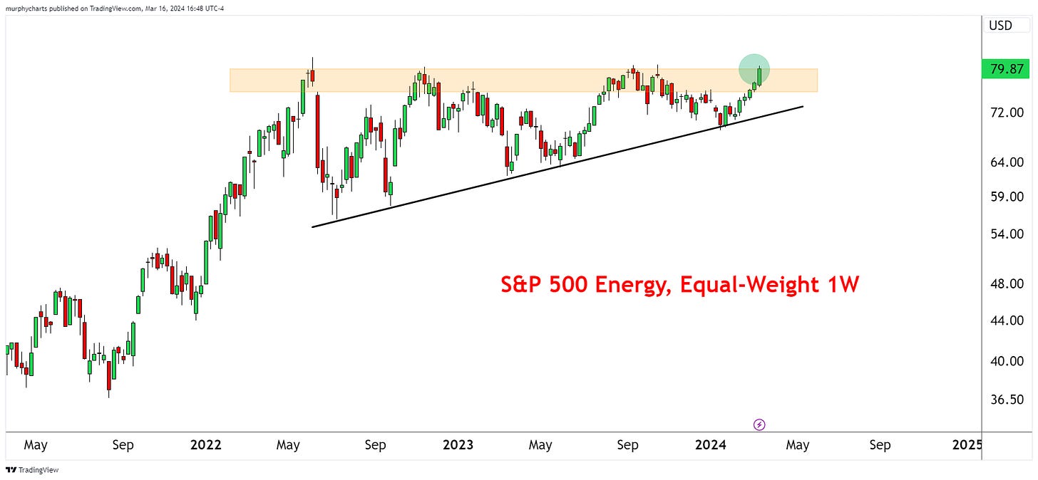
Equal-Weight S&P 500 Energy (price)

New multi-year weekly closing high and blasting through a resistance level that dates back to June 2022. A mentor of mine would say, “There’s no such thing as a quadruple top!” The sector continues to digest overhead supply, but is forming higher lows in the process. Objectively bullish price action.

Equal-Weight Energy vs. Energy (price)

If energy commodity prices are expected to rise, we’d like to see the equal-weight energy index outperform the market-cap weighted index. This would point to increased participation and strength of trend. Right now, the price ratio is trading above an upward sloping 200-day moving average. The trend is still in favor of rising energy prices.

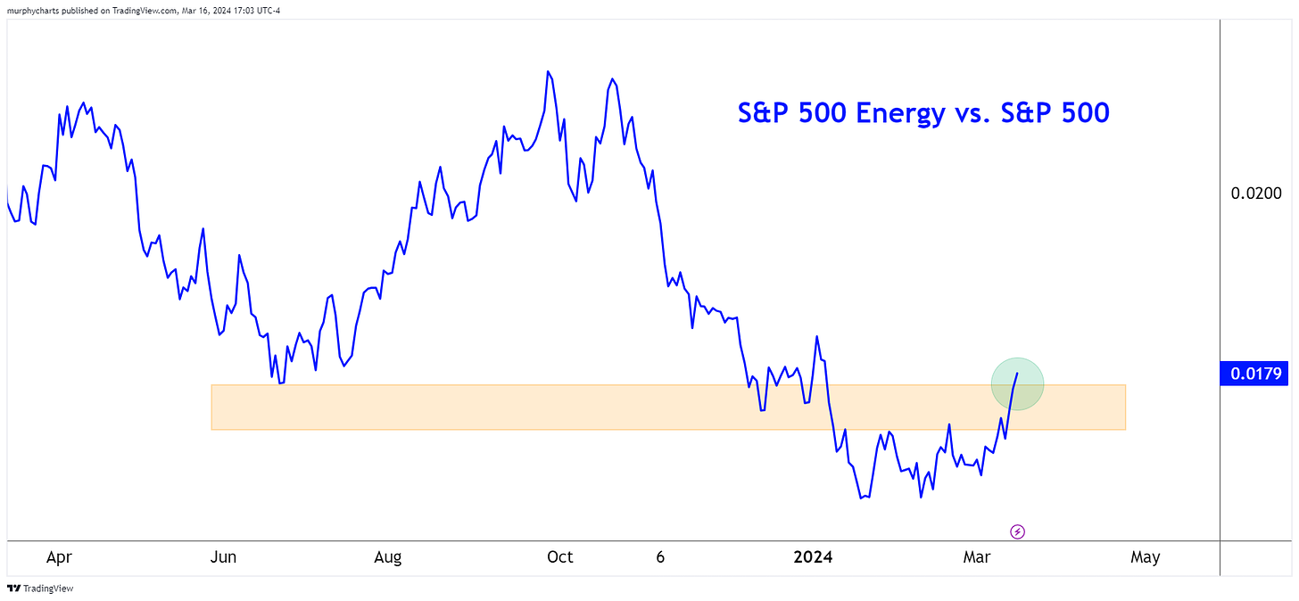
S&P 500 Energy vs. S&P 500

Q4 2023 saw big relative underperformance from the Energy sector. This year started on the same note – but things changed over the last few weeks. The Energy sector relative to the S&P 500 index is forming new multi-month highs. The ratio is now trading above a well-tested support/resistance zone.


Energy still only accounts for a 3.7% weighting in the S&P 500 Index. It’s crazy to think that only a few decades ago, several top 10 names in the S&P 500 Index were from the Energy sector! Energy commodities and energy companies can be a great portfolio diversifier, especially in today’s world as technology dominates the global equity market.

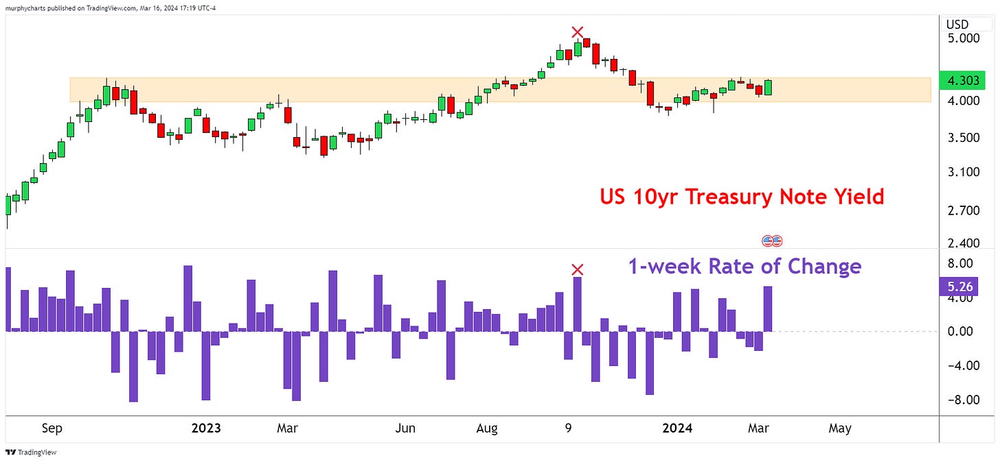
I’ll end with a chart of the US 10-year Treasury Yield. It’s not just fund manager surveys that are pointing out inflation fears. The bond market agrees with this sentiment. The US 10-year yield rose 23 bps this week – the largest weekly rise since October 2023. If the bond market wasn’t worried about inflation, yields would be moving the other direction!

That’s enough out of me.

SM

Contributor(s)

Shane C. Murphy, CMT

Shane Murphy is an Associate at Michael Roberts Associates Inc. an independent wealth management firm located in Syracuse, NY. Prior to that, Shane worked in portfolio construction and research for an independent RIA. He also has experience in municipal finance, working at...

10-Year Treasury Rates: A Monthly/Secular Perspective Overview

I begin each year by reviewing the long-term technical positions and behaviors of what I think of as the “Big Four”—10-Year rates, S&P 500 ($SPX), Commodities, and the US Dollar. I believe that rates, particularly in a credit dependent/leveraged system, generally drive both the economic and market cycles. And, since by profession I am a rates/credit portfolio manager, strategist and trader, I always begin there.

Granted, a macro view doesn’t often inform short term trading, but anything that helps me understand the ebb and flow and interconnectedness of markets is helpful. More importantly, recognizing markets that are aligned for significant macro change can be invaluable, particularly in terms of risk management.

Since most good technical analysis is fractal, the same techniques used to describe the macro ebb and flow can often translate to shorter time frames. For the first two decades of my trading career I kept a manual grid of the big 4 plus a few other markets (gold, oil, 2-year Treasury and so forth) that I updated hourly with price and the change from the prior hour. By doing so, I learned a great deal about market interactions and interrelationships.

Monthly 10-Year Note Yield

<<A reminder that falling bond yields are synonymous with higher bond prices. In other words, a downtrend in yield = a bull market in bonds.>>

Over the last four decades bond yields had consistently and reliably made lower highs and lower lows. The entire bull market was defined by a broad declining channel (A–B, C–D). The A–B downtrend line represented the “stride of demand” or the zone where buyers consistently emerged and the C–D line represented the “overbought line” or the zone where supply or sellers consistently emerged.

From 2012 forward there were growing signs that the long downtrend was aging. Four things stood out.

  1. The repeated failure to push to the oversold line (C–D).
  2. The flattening out of the decline where each push to a new yield low only covered around 100 bps.
  3. The 2018 spike to 3.24% that weakened the primary A-B downtrend.
  4. In March of 2020 bonds pushed to the area around the center of the channel, failed to push beyond the midline much less into the overbought line (C–D). This change of behavior strongly suggested that demand was tiring. Multiple visible changes of behavior strongly suggested that the 40-year downtrend was in danger of terminating.

Now, the clear break and acceleration above the A–B downtrend has moved the long trend from bullish to neutral. While it’s likely that the move above November 2018 pivot @ 3.24% coupled with the prior changes of behavior mark the beginning of a long-term bear market, a higher low (perhaps forming in 2024) is needed to complete/confirm that change.

Note the additional changes in behavior. The 459 bps move from 0.39% to 4.98% represents the single largest bearish move since the inception of the bull market in September 1981, and the MACD oscillator level far exceeded the levels that marked yield highs over the course of the entire bull market.

10-Year Monthly with MACD

After producing the most overbought reading since the 1980s, the oscillator is trying to roll over and displaying a small negative divergence (suggesting lower yields and higher price). While not a definitive roll, it certainly suggests that there is some potential for a meaningful turn.

Monthly 10 Year Note Yield:

The following are several key fundamental points around rates:

  • The defining macro characteristic of the 40-year bull market has been the continual fall in the inflation rate. If that is changing (I believe that it has), the secular bond trend is likely to also change.
  • If the trend in inflation is changing, the negative correlation between bonds and equity that drives 60/40 allocation and risk parity investing is likely to flip and become positive. In other words, bonds and equity would, outside of periods of panic or economic distress, rise and fall together destroying the diversification benefit. This has been the historical norm and I expect that the market will gradually move in that direction.
  • The caveat being: Quantitative easing removed the value proposition from bonds, when equities began to decline in 2022 bonds couldn’t provide a safe haven. They were already far too expensive, particularly in the context of a Federal Reserve aggressively tightening monetary policy. That is no longer the case. Bonds, while still expensive, can again provide a tactical hedge should risk assets or the economy weaken dramatically.
  • At first glance, this seems at odds with the change in correlation discussed above, but it is a difference between the secular tide versus the intermediate wave.
  • Most substantive bond rallies are the result of a crisis that creates a flight-to-quality. In an economy that is overly financialized and levered, rising rates often break the weakest link in the economic chain, creating a new crisis and a subsequent flight to quality rally. While so far, there is little evidence of a systemic crisis, the lagged effect of the rapid increase in rates in an overly financialized system must be top of mind.

While there is still more work to be done to confirm the trend change, I believe the bond trend is finally changing as the world moves from the deflationary backdrop of the last several decades to an inflationary backdrop. I will be a much better seller of rallies and bearish technical setups in the weekly/intermediate perspective.

Contributor(s)

Stewart Taylor, CMT

Stewart Taylor is a Vice President, Portfolio Manager and a Senior Fixed Income Trader for the Investment Grade Fixed Income team at Eaton Vance Management in Boston, Massachusetts.  He is also co-portfolio manager of the Eaton Vance Short Term Real Return Fund...

ESG and SRI: Using Technical Analysis

Back in the day (and to me, that means the mid-2000’s) when I was 4+ years into my career, I had a new client ask if I managed “Socially Responsible” portfolio models.

First off, I hadn’t even heard of them, but I simply answered, “I don’t… but for you, I can.”

So, I looked into it, did some reading, and what I learned was that Socially Responsible Investing came in a few different versions back then.  There were some mutual funds that avoided “sin” stocks (such as cigarettes, tobacco, and pornography), other funds were more religious-based in nature, but there weren’t a lot of them to choose from.

Still, I built a portfolio for this client and in the first few years, they stuck with it.  A couple years later, the lag in performance caused them to want to move half of their money to a more “traditional” portfolio model, and within a total of maybe 6-7 years, they had completely exited the SRI model and I closed it down.

Today, however, there are way more options to choose from, and not only are the options vast, but there are also a lot of ETFs available that are much lower-cost than the old mutual funds that are still out there today.  If that wasn’t good enough, the concept of SRI got a new name, and the industry started calling it Environmental, Social, & Governance (or ESG for short).

Fast forward a few more years and again, we had a new client reach out and ask if this was something we did, but this time, there were so many more options to pick from, so I built another ESG/SRI model and the back-testing came in much better than the lagging performance we experienced from the old mutual fund models.

Just for fun, let’s start with answering the questions, “Are mutual funds better than ETFs or Stocks?”

To be fair, I simply googled the best ESG and SRI mutual funds and ETFs in 2023 and got this article from Nerd Wallet as opposed to cherry picking my own funds to show my bias.

As you can see in the relative comparison chart above, the #1 performing ESG option is, in fact, a mutual fund (Vanguard’s World Fund), however, the 2nd, 3rd, and 4th place winners are all ETFs – and again, in the interest of fairness, the article included the top-performing ESG funds over the last 5 years… and then listed the lowest-cost ETFs with no regard to ROR.  In other words, this was definitely not fair to the ETFs in question, but still, 3-of-7 ended up in the top-4, so that’s saying something!

Anyway, in case you can’t tell what my bias is, I’m a fan of lower-cost, passive ETFs than I am mutual funds.  In fact, we haven’t used a mutual fund at our office in any portfolio models since we closed down the first ESG/SRI model “way back when” (there’s that phrase again).

Oh, and individual stocks can add some serious spice to an ESG portfolio, by the way.  You just have to ensure you’ve got a process for picking the right ones and managing risk along the way, so let’s talk about that…

The first thing you need to do in order to build an ESG/SRI stock model is to build an inventory of companies that qualify as being “socially responsible.”

I didn’t use either of the lists that follow, but to give you a start, here’s a list of the 10 Most Popular Stocks for ESG Funds from Investopedia, and then here’s an even bigger list from IBD.

It would be my recommendation to have an inventory that is much larger than 10 stocks, so please expand your list to at least 30-40.  There are other lists out there – I personally built my list of more than 100 names from an inventory that started as a socially responsible index, for instance.

From there, one great way to rank the stocks is by using relative strength.  This can be a ranking of performance over time, it can be days, weeks, months, you can use a Relative Rotation Graph, or you can remove time altogether and use a Point & Figure chart (or matrix), as I’ll explain later.

For the above-listed inventory, I used a weekly ranking system over time and broke them out into deciles.  From there, I can then make my life easier by focusing only on the high-RS stocks, then analyzing the chart for each at the right, observing trend and momentum.

In this case, Williams Sonoma (WSM) ended up being the top-ranked stock, and I also noticed that there was a positive divergence that came out of momentum last spring, and the stock followed through to the northside in summer.

Now that we know what to do, let’s discuss what NOT to do.  The above listed stock is Avis Budget Group (CAR), and it also happens to be the bottom-ranked stock in the ranking system.

You can analyze the chart at the right (but be careful if you have a weak stomach), and along with its awful ranking, you can see a clear downtrend, a stock drowning below its 200-day moving average, with some terrible momentum staring you in the face from our friend, RSI in the bottom pane.

This is a good time to say that, in technical analysis, we don’t care much about the company’s story, what it’s P/E ratio is, or if it’s “gone up too much.”  We care about buying strong stocks in strong sectors, in strong asset classes with strong trends and strong momentum – we like buying stocks that are going up… not stocks that are going down.

Here’s another way to pick ESG/SRI stocks – with a Relative Rotation Graph (or RRG for short).  This might look like a lot of spaghetti at first, but it’s actually one of THE best ways to visualize relative strength (or high-RS stocks).  First, let’s understand the quadrants on the chart:

  • Upper left = Improving vs. the benchmark
  • Upper right = Leading the benchmark
  • Lower right = Weakening vs. the benchmark
  • Lower left = Lagging the benchmark

The “benchmark” is whatever you want it to be, but in this case, it’s the S&P500, and it lies at the zero point on the x/y axis.

Now, you might think to yourself, “I want to own stocks that are leading the benchmark,” right?  Well, you’re close – but entry points using RRGs requires a little art, a little science, and a lot of testing.

Nerd’s Note:  That oblong oval I added to the middle of the chart isn’t a portal… it’s an area that measures 2 standard deviations from the benchmark on a relative basis.  The purpose is to “weed out” all the stocks that are trading near-center.  Stocks that are behaving with roughly the same or similar RS to the market overall.

I circled a few stocks in the RRG above.  Notice what they all have in common?  They’re all exiting the lagging quadrant, pointing northeast, and have entered the improving quadrant.

Now, buying a stock that is still in the lagging quadrant, but pointing northeast and moving toward the improving quadrant can be an even better entry point.  Furthermore, buying a stock that has already left the leading quadrant, but it’s done a 180-degree turn and “jackknifed” back upward, where it’s pointing northeast again, toward the leading quadrant… this can also be a great entry point as well.

In either case, once you identify potential candidates for your portfolio, you then must analyze the individual chart, look for trend, momentum, and above all, know what your exit strategy is before you even get in.

I showed you what a static RRG looks like using my inventory of ESG/SRI stocks today, but I thought it would be fun to animate the chart, just to show you how these things work over time.

Notice anything about the direction of the rotation for most of the stocks on the chart?  Yep – they’re generally moving clockwise.  This is why I mentioned that RRGs are one of the best ways to visualize relative strength – and if nothing else, a chart like this is outright proof that RS exists!

Since we expect the chart to move clockwise, then we know that eventually, the stocks we buy will end up failing, falling out of favor, and lagging the market.  For this reason, I feel it’s necessary to repeat the fact that having an exit strategy is so crucial to the success of any portfolio management model.

Firefighters, SWAT teams, the Navy Seals – none of them go into battle without an exit strategy – and when it comes to your money, you shouldn’t, either.

Here is my last chart of the article.  Sorry it’s so messy, but I promised (above) that I’d show you how to remove time from a ranking system, and doing so is all about using Point & Figure (PnF) charts, which can get a little messy-looking (instead of spaghetti, PnF matrices look more like chess boards).

There are a couple ways to use it as a ranking system, but I’m going to focus on the simplest – a buy-signal ranking system.

If you look down the list on the left, you’ll see the list of symbols and stocks.  Then, if you look across the top-right, you’ll see the same exact symbols (although, I ran out of screen room and couldn’t screenshot all of them, but they’re all there).

What’s happening here is, each stock is essentially “going into battle” with every other stock in a round-robin, battle royale.  Each and every day, this matrix refreshes and it gives me a new ranking system based on the price movements of the most recently closing price for each stock.

Because PnF charts don’t use time as an input, if there is no price movement, then there would be no change in the ranking.  In fact, while very unlikely, we could go six months and if there wasn’t a single move in price for any of the stocks in the matrix, then there would be no change in ranking!

A “buy signal” simply means that the stock has printed a higher-high on a PnF chart using a 3-box reversal method.  Again, I don’t want to make this more complicated than it needs to be, but let’s just say that each buy-signal is a “win” for that stock, and when all those wins are tallied up, the one with the most buy signals is the top-ranked stock, second-most is the second-ranked stock, and so on.

In the end, you find yourself with a ranking system that observes price, alone, with no time accounted for in your back test.  So, if there are a big movements in price, but with no regard for time, then the ranking system will change.

While PnF doesn’t get a lot of attention, I feel they’re a great tool to have in your toolbox of technical indicators and ranking systems… but it should go without saying, if I can say it one more time today – that no matter what your screening process for new investments – always, always, always have an exit strategy!

Contributor(s)

Adam Koos, CMT, CFP®, CEPA

Adam Koós, CMT, CFP®, CEPA, is the president, portfolio manager, and Senior Financial Adviser at Libertas Wealth Management Group, Inc., located in Columbus, Ohio.  His professional journey began just 10 days before the tragic attack on the World Trade Center in 2001....